Everyday Outfit Color Matching: Base, Neutral, Accent
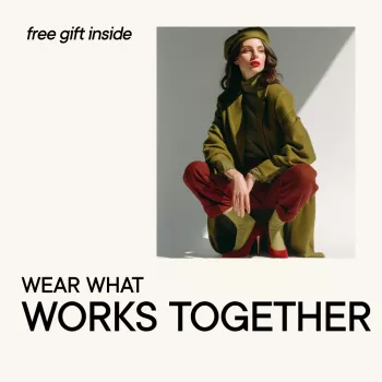
Wear What Works Together: A Practical Color-Matching Guide for Confident Everyday Outfits (Digital Download)
Getting dressed is easier when colors stop feeling like guesswork. Color matching doesn’t require a “perfect” eye—it needs a simple system you can repeat: choose a dependable base, add a supporting neutral, and finish with one intentional accent. The result is an outfit that looks pulled-together, feels like you, and works for real life (workdays, errands, travel, and everything in between).
What “colors that work together” actually means
Colors that work together don’t mean every piece matches exactly. It usually means the outfit has clear roles and a balanced mix of harmony and contrast—so nothing fights for attention.
- Harmony is the balance between a main color, supporting neutrals, and one accent—not perfect matching.
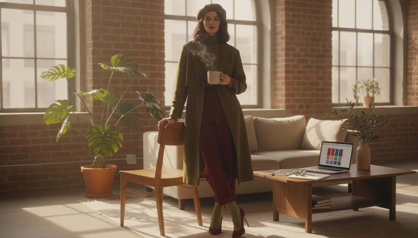
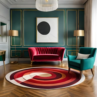
- Strong outfits give each color a role: base (largest area), support (second-largest), accent (smallest).
- Contrast can come from light vs. dark, warm vs. cool, or muted vs. bright. Pick one main contrast type at a time for a cleaner look.
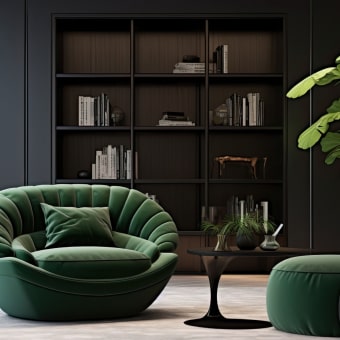
- Neutrals go beyond black and white: navy, olive, taupe, chocolate, and charcoal often behave like neutrals in everyday wardrobes.
| Role | How much to use | Examples | Best for |
|---|---|---|---|
| Base color | 50–70% | Navy trousers, camel coat, denim, black dress | A grounded, easy-to-repeat look |
| Support color | 20–40% | Cream knit, gray blazer, olive skirt | Depth and structure without visual noise |
| Accent color | 5–15% | Red bag, cobalt earrings, scarf print | Personality and focal point |
Start with your closet: pick 3 dependable bases
Instead of trying to make every color work, choose three base colors you already reach for. These become the “home base” for your outfits and shopping decisions.
- Pick three bases you already wear often (common choices: black, navy, denim, camel, gray, olive).
- Make sure each base works across seasons—pairable with light tones (spring/summer) and deeper tones (fall/winter).
- Keep bases in similar “strength”: if your wardrobe is mostly muted, choose muted bases; if it’s crisp and high-contrast, pick stronger bases.
- If you’re stuck, choose: one dark neutral, one light neutral, and one soft color-neutral (like olive or burgundy).
Example base-color trios (mix-and-match friendly)
- Navy + Cream + Denim: clean contrast with a casual anchor; easy with tan, rust, soft pink, gold.
- Black + Gray + Camel: polished and office-ready; easy with white, burgundy, forest green, silver.
- Olive + Ecru + Chocolate: warm, earthy, low-stress; easy with terracotta, denim, blush, brass.
Use simple color families to build outfits fast
Most everyday outfits get easier when you lean on a few “families” of combinations. These are based on classic color relationships (a helpful overview appears in Encyclopedia Britannica’s color theory guide and explanations of the color wheel at Color Matters).
- Monochrome: one color in multiple shades for instant cohesion (light blue shirt + mid-blue jeans + navy jacket).
- Analogous: neighboring colors for a styled-but-soft effect (olive + mustard, navy + teal).
- Complementary (with restraint): opposites used with one as an accent (navy + rust, green + pink).
- Neutral + color: a neutral base with one “hero” color stays wearable and repeatable.
Low-effort outfit formulas to keep on repeat
- Neutral base + accent: keep the accent under 15% (black outfit + red shoes or bag).
- Monochrome ladder: stack three shades of one color (cream top + camel belt + chocolate boots).
- Analogous pair + neutral: two neighbors plus a calm anchor (navy + teal + gray).
- Print as the accent: pull one color from the print (striped top + denim + shoes matching one stripe).
Warm, cool, and muted: the easiest way to avoid “something feels off”
If an outfit technically “matches” but still looks slightly wrong, undertone and intensity are usually the reason.
- Warm colors have yellow/golden undertones (camel, warm beige, rust). Cool colors have blue/rosy undertones (icy gray, cobalt, berry).
- Muted colors look softened (dusty rose, sage, slate). Bright/clear colors look saturated (true red, emerald).
- Outfits look most natural when undertones match—warm-with-warm or cool-with-cool—especially near the face.
- If you mix temperatures, keep one dominant and use the other as a small accent (cool outfit, warm tan belt).
Build confidence with repeatable “anchor” combinations
Anchors are your automatic wins—color pairs you know look good. The goal is to reduce decisions without looking repetitive.
Accessories that make anchors easier
- Wear What Works Together – Color Matching Guide (Digital Download) (a quick-reference system for base/support/accent, undertones, and dependable pairings)
- Women’s Soft PU Leather Rivet Backpack Large Fashion Daypack (a practical “support neutral” bag that can help anchor casual outfits)
Digital download guide: what it helps with (and how to use it)
The Wear What Works Together – Color Matching Guide (Digital Download) is designed to turn color theory into daily outfit choices you can repeat—without overthinking.
Best moments to use the guide
FAQ
What colors go together for everyday outfits without looking too loud?
Start with a neutral base like navy, gray, denim, or camel, then add one muted accent (sage, dusty rose, rust, or soft blue). Analogous pairings (neighboring colors) also read polished because the contrast stays gentle and the accent stays small.
How can an outfit look coordinated if it uses more than two colors?
Use the base/support/accent approach: one color dominates, one supports, and one stays minimal (often in accessories). For an easy shortcut, repeat one shade twice (shoes and bag, or top and earrings), or treat a print as the accent and match one color from it.
How do you know if a color is warm or cool when shopping online?
Compare the item to true white or true black in the photos: warm shades tend to look golden or creamy, while cool shades look icy, blue-based, or rosy. Product descriptions often hint at undertone (“golden,” “sand,” “icy,” “blue-toned”), and sticking to proven anchor palettes reduces risky buys.


Leave a comment