Wearable Autumn Color Palette: Easy Capsule Wardrobe Guide
Fall Into Your Best Colors: A Wearable Autumn Palette Wardrobe Guide
Autumn palettes shine in warm, muted, grounded tones—colors that make skin look clearer, eyes brighter, and outfits feel effortlessly cohesive. Instead of fighting with stark contrast or icy brights, an Autumn-leaning wardrobe leans into earthy harmony. Below is a practical way to recognize the vibe, choose reliable neutrals, build repeatable outfit formulas, and shop with more confidence so getting dressed feels easy—and looks pulled together. For more guidance, see The Definitive Guide to Fall Clothing Colors | Color Analysis Blog.
What an Autumn palette looks like (and why it’s so wearable)
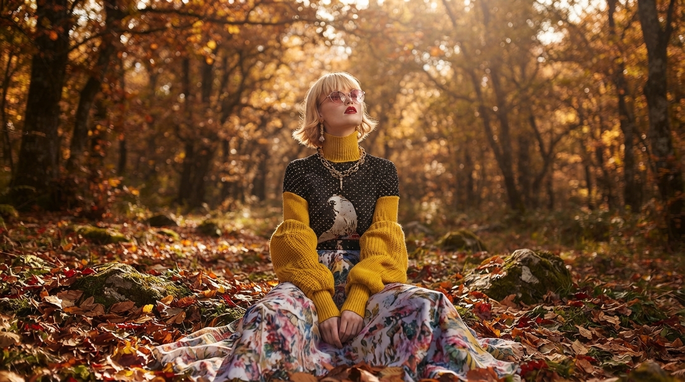
An Autumn palette typically reads warm, medium-to-deep in value, and softened in intensity (more “spiced” than “neon,” more “toasted” than “icy”). The overall effect is grounded and rich—like fall light rather than winter glare. For further reading, see Start Your Fall Wardrobe with a Color Palette You Love.
- Overall effect: warm undertone, medium-to-deep value, and muted (softened) intensity.
- Common wins: earthy reds, golden browns, olive greens, warm teals, mustard, rust, terracotta, camel, warm navy.
- Typical misses: stark optic white, blue-based pinks, cool grays, icy pastels, high-contrast black-and-white pairings.
- Style advantage: many Autumn shades act like elevated neutrals, so mixing colors doesn’t feel loud or costume-y.
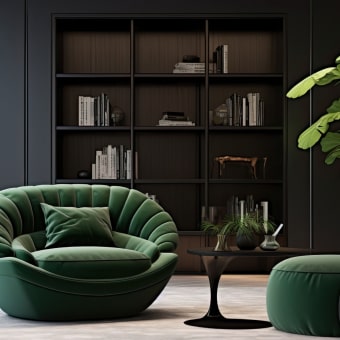
If you enjoy color but want outfits that still feel “neutral-friendly,” Autumn is one of the most mixable families. Texture also plays beautifully with these shades—think knits, suede, leather, tweed, and brushed cotton.
Quick self-check: warm, muted, or deep?
Seasonal color can get overly technical, so a quick self-check helps narrow the most wearable direction within Autumn.
- Warmth test: gold jewelry tends to harmonize more than bright silver; creamy whites look better than crisp white.
- Muted test: dusty versions of colors (sage, brick, cocoa) feel calmer on the face than saturated jewel tones.
- Depth test: medium-to-deeper shades (espresso, forest, warm navy) feel more natural than very pale pastels.
- Mixed results: treat Autumn as a starting point—keep warmth consistent, then adjust softness and depth until it clicks.
Autumn spectrum cheat sheet
| If this is true… | Try more of… | Try less of… |
|---|---|---|
| Warm + muted (soft overall) | sage, moss, cocoa, warm taupe, muted teal | neon brights, icy pastels, stark black |
| Warm + deep (high richness) | espresso, aubergine-brown, forest, warm navy, rust | light pastels, cool gray, bright white |
| Warm + clearer (slightly brighter) | spiced coral, turmeric, clear warm teal, warm tomato red | blue-based pinks, cool blues, icy mint |
Build a flattering foundation: Autumn neutrals that replace black-and-white
The fastest way to make Autumn colors feel “expensive” is swapping harsh basics for warm alternatives. You still get crisp outfits—just without the icy contrast.
Easy Autumn neutral swaps
| Instead of… | Choose… | Why it works |
|---|---|---|
| Optic white tee | ivory or cream tee | softens contrast and keeps warmth near the face |
| Black blazer | espresso, warm navy, or deep olive blazer | still sharp, but more harmonious with warm coloring |
| Cool gray knit | warm taupe or cocoa knit | adds warmth without looking loud |
| True black boots | chocolate or espresso boots | elongates the leg while staying cohesive with earthy outfits |
Outfit formulas that make Autumn colors feel effortless
Color perception can shift under different lighting—sunlight, office LEDs, and warm indoor bulbs all change how “warm” or “muted” a garment reads. If you’re curious about why, the CIE overview of the Color Rendering Index (CRI) is a helpful reference, and Pantone’s color systems overview shows how standardized color communication works across materials.
What to buy first: a small Autumn capsule that repeats well
Starter Autumn capsule (12-piece idea)
| Category | Best-bet colors | Notes |
|---|---|---|
| Top (2–3) | ivory, warm teal, rust | keep necklines close to face in your best shades |
| Knit (1–2) | cocoa, moss | texture (ribbed, brushed, tweed) suits earthy palettes |
| Bottom (2) | warm navy, olive | choose cuts that work with most shoes you own |
| Layer (2) | camel coat or jacket, espresso blazer | anchors the palette and elevates basics |
| Shoes (2) | chocolate, espresso | boots or loafers pair with denim and dresses |
| Accessory (1) | tortoiseshell/gold hardware bag | ties outfits together with warm details |
Common pitfalls and easy fixes
A guided way to map your best Autumn palette to real outfits
If you want a curated set of Autumn-leaning colors with outfit pairings you can repeat, Fall Into Your Best Colors | Autumn Color Palette Clothing Guide Ebook for a Flattering, Wearable Wardrobe is built to translate seasonal color ideas into practical combinations—especially helpful when you’re choosing neutrals, planning a capsule, or deciding which “almost right” shades to skip.
To finish outfits in a way that matches the palette’s warm details, consider accessories with earthy hardware and texture—like the Women’s Soft PU Leather Rivet Backpack Large Fashion Daypack for everyday errands, commuting, and travel days when you still want your look to feel coordinated.
FAQ
Can someone wear an Autumn palette if they have cool-toned hair or eyes?
Yes—palette harmony is more about skin undertone and overall contrast/softness than one feature. Try warm neutrals like ivory, camel, and warm navy near your face, then adjust depth (deeper or lighter) and softness (more muted or clearer) until it feels balanced.
What are the best Autumn-friendly alternatives to black and bright white?
For darks, choose espresso, warm navy, or deep olive; for lights, choose ivory, cream, or oatmeal. Keeping the softer light neutral closest to your face usually makes the biggest difference.
How do Autumn colors translate to a work wardrobe without feeling too casual?
Use structured pieces like trousers and a blazer in warm navy or espresso, paired with a cream blouse. Add one accent (rust or teal) through a scarf or knit, and keep prints warm and muted for a professional finish.


Leave a comment